Portfolio concept / 04
Cover Shot Darts
A cinematic darts retail concept that pairs a striking sporting identity with a hands-on introduction to the equipment.
A landing page concept for Cover Shot Darts, presented as a design and development example.
01 / The brief
Make specialist equipment feel approachable.
The design introduces Cover Shot Darts through the moment of a throw, then explains the equipment behind it. The aim is to help visitors explore the range and understand the role of each component before choosing a setup. This is presented as a landing page concept, with no checkout or live business contact details.
02 / Across screens
The same idea.
A different screen.
Desktop balances the headline against a large dartboard photograph. On a phone, the message and actions stack above a separate image crop, while the navigation reduces to the brand and a direct Explore link. The equipment explorer remains usable with touch and keyboard.
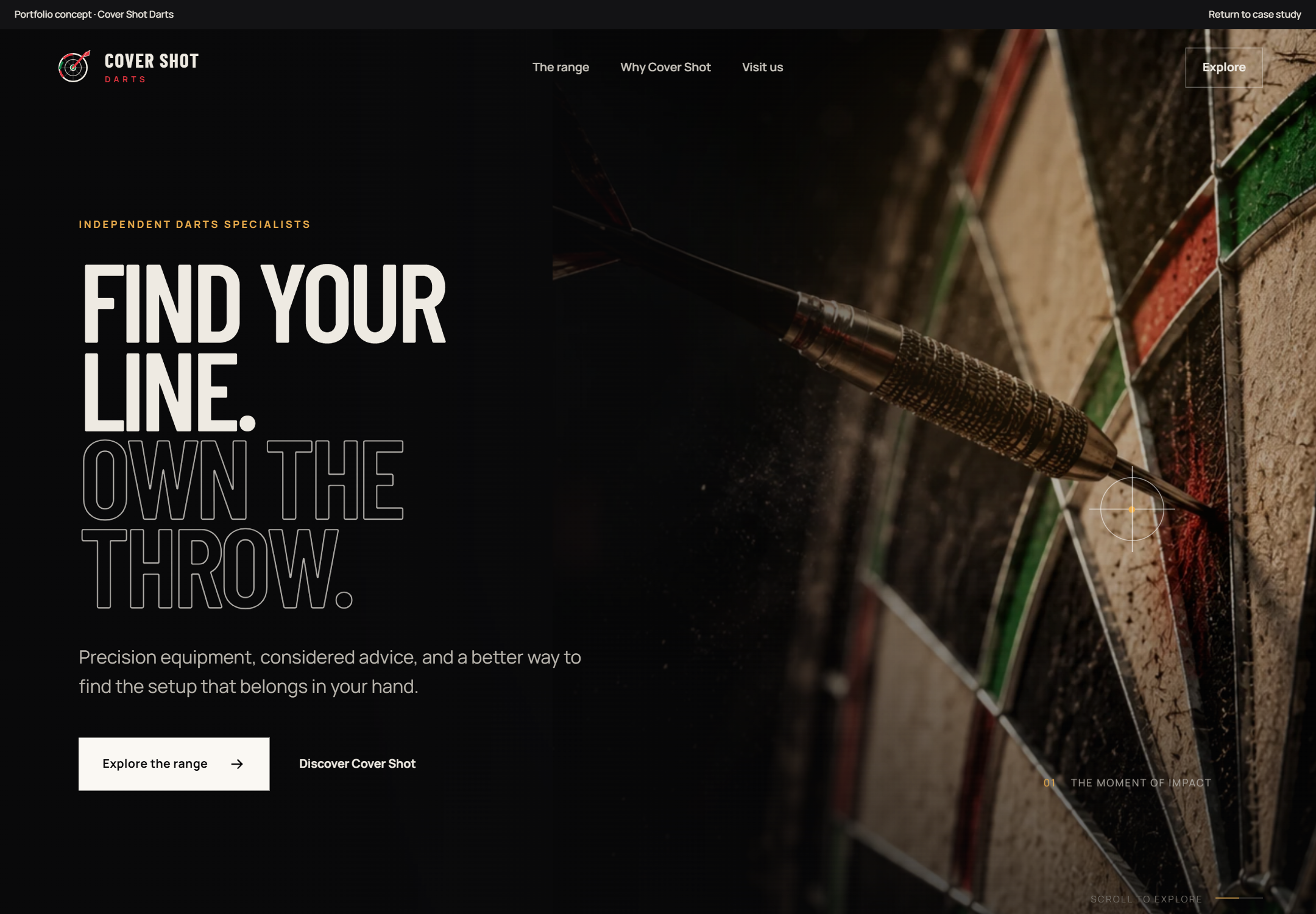
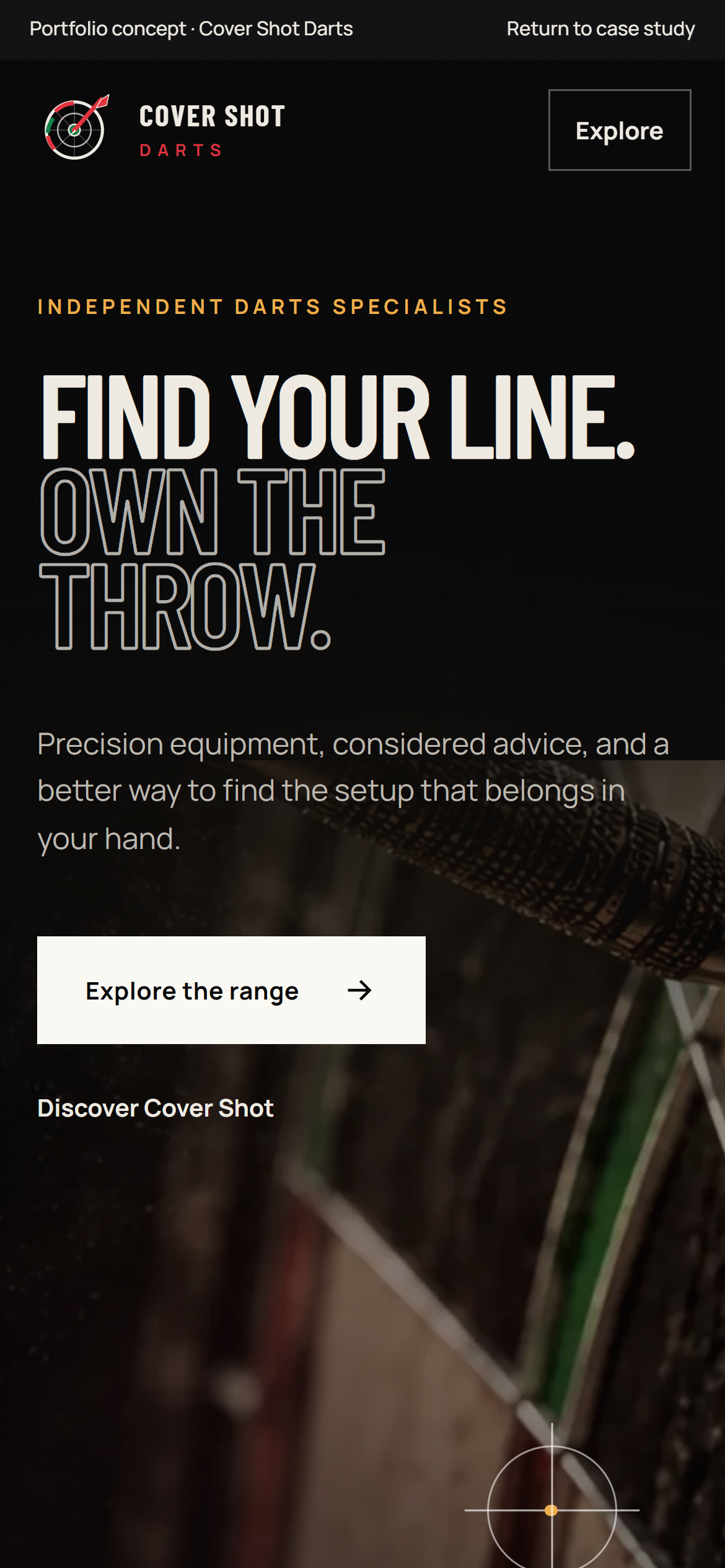
Screenshots of the working concept with reduced motion enabled. The mobile original is captured at three times its display resolution. Open either image to inspect it at full size.
03 / Design decisions
Three choices.
Each with a purpose.
Lead with the moment of impact.
The first screen needs to communicate the character of a specialist darts brand before explaining individual products.
Close-up dartboard photography, condensed headlines and an outlined second line establish the sporting direction. A dark gradient protects text contrast while keeping the photograph visible.
View the openingExplain the equipment through interaction.
Point, barrel, shaft and flight are easier to understand when visitors can connect each name to a visible part of the dart.
The component explorer pairs an illustrated assembly with four selectable explanations. Visitors can use pointer, touch, focus or the arrow keys to explore how the parts affect the throw.
Explore the dart componentsKeep the motion optional.
Scroll effects can support the sporting story, but the message and controls need to remain usable at different screen sizes and with reduced motion.
Progressive scroll scenes and subtle pointer effects add depth on suitable devices. A reduced-motion preference keeps the content visible without those effects, and mobile uses its own image crop and simpler navigation.
Follow the visual story
04 / Visual direction
A distinct identity.
Near-black surfaces and warm off-white lettering create a focused sporting identity. Gold highlights pick out details, while red and green accents connect the mark to the dartboard.
Near black#0A0A0B
Warm paper#EEEAE2
Gold#C88A2D
Board red#E3343F
Typography
Barlow Condensed gives the headlines their sporting character. Manrope supports the longer explanations and navigation, with fonts hosted locally.
05 / What it demonstrates
The thinking behind the build.
- Distinct sporting identity
- Keyboard-accessible equipment exploration
- Responsive imagery and reduced-motion support
This case study presents the design and working interactions of the Cover Shot Darts concept. No sales figures, customer testimonials or business results are claimed.
Explore the concept