Portfolio concept / 03
Fitness / Personal coaching
Altitude.
A distinct fitness concept built around useful strength, calm expertise, and a journey that helps people find the right place to begin.
Explore the live concept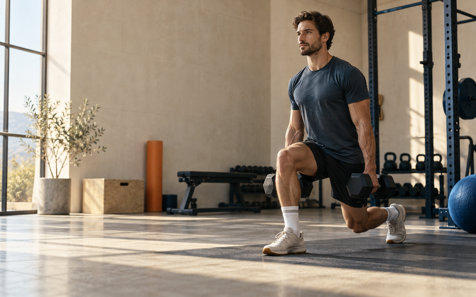
01 / The opportunity
Make coaching feel considered,
not intimidating.
Fitness websites often default to two extremes: aggressive performance imagery or generic wellness language. Altitude needed another position—credible enough for experienced clients, but human enough for somebody taking a first step.
The experience therefore treats coaching as a thoughtful service. It explains the method, demonstrates how a week could fit, and creates a low-pressure route into a conversation.
02 / Experience principles
Three decisions
shape the site.
- 01
Create momentum.
Bold composition and athletic pacing make the site feel active without relying on noisy effects.
- 02
Personalise discovery.
A focused programme selector turns vague ambition into a concrete, understandable starting point.
- 03
Convert without pressure.
Clear explanations and an honest consultation invite replace manufactured urgency.
03 / Visual system
Editorial energy.
Athletic restraint.
The identity steps away from the dark-neon gym category. Warm paper and morning light make the concept approachable; cobalt carries confidence; burnt orange adds physical warmth and direction.
Strong enough
for real life.
04 / Interaction
Show the next step,
then let it adapt.
The programme finder is intentionally simple: one useful question, an immediate recommendation, and a sample week that changes with the answer. It adds relevance without turning the page into a form-heavy app.
Try the programme finder05 / Direction
Inspired by a category.
Designed as its own system.
The direction combines the confidence of editorial sports publishing, the clarity of modern class discovery, and the energy of expressive fitness typography. Those cues are translated into an original layout, palette, and interaction language for Altitude.